

This article was translated by AI from the Chinese version.
Introducing Element UI
This is for newer developers who have never used it. Experienced developers can probably skip it.
First, links for the great Element UI:
Its latest version is called Element Plus. In the official words, it is a component library based on Vue 3 for designers and developers.
For example, instead of building a login button from scratch, you can use a ready-made component in your front-end project.
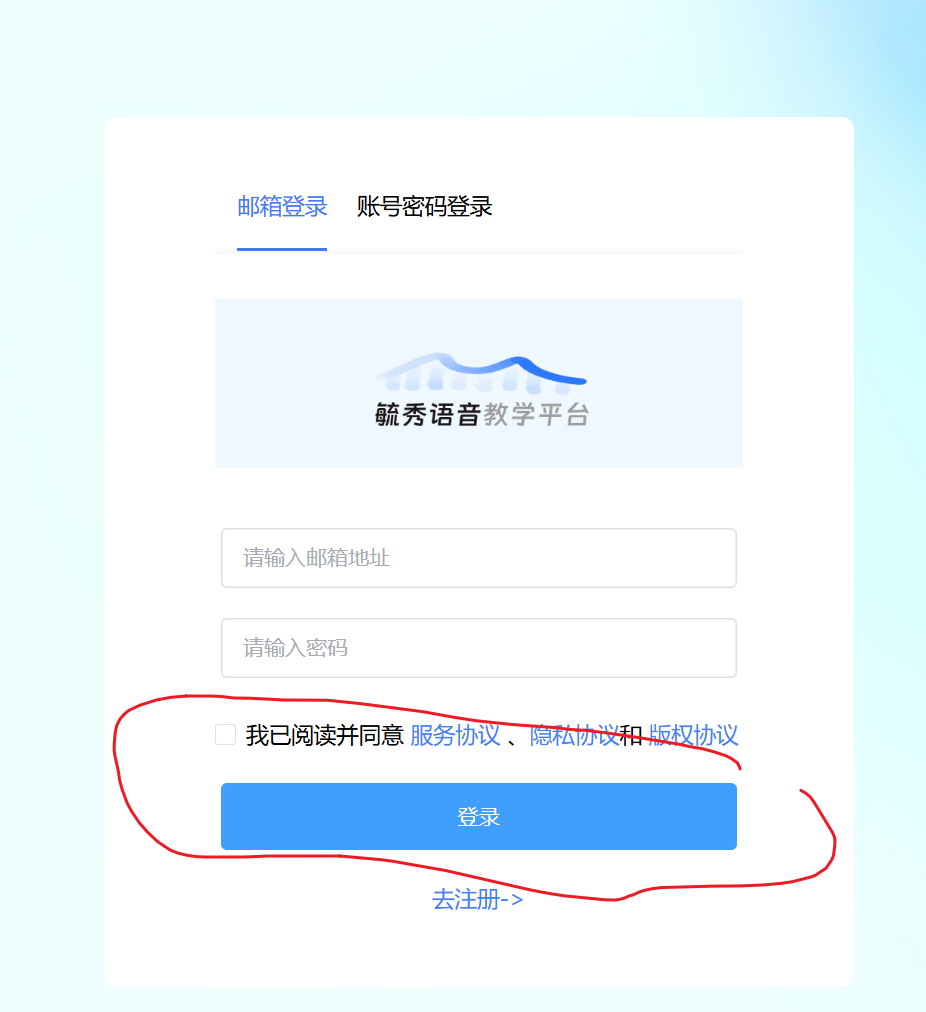
<el-button type="primary">Log in</el-button>Components
Content Components
Components such as Card, Button, Input, and Icon are used as part of a page layout. The best part is how much time they save: open the package and use it.
They are also reasonably extensible. Take Input as an example:
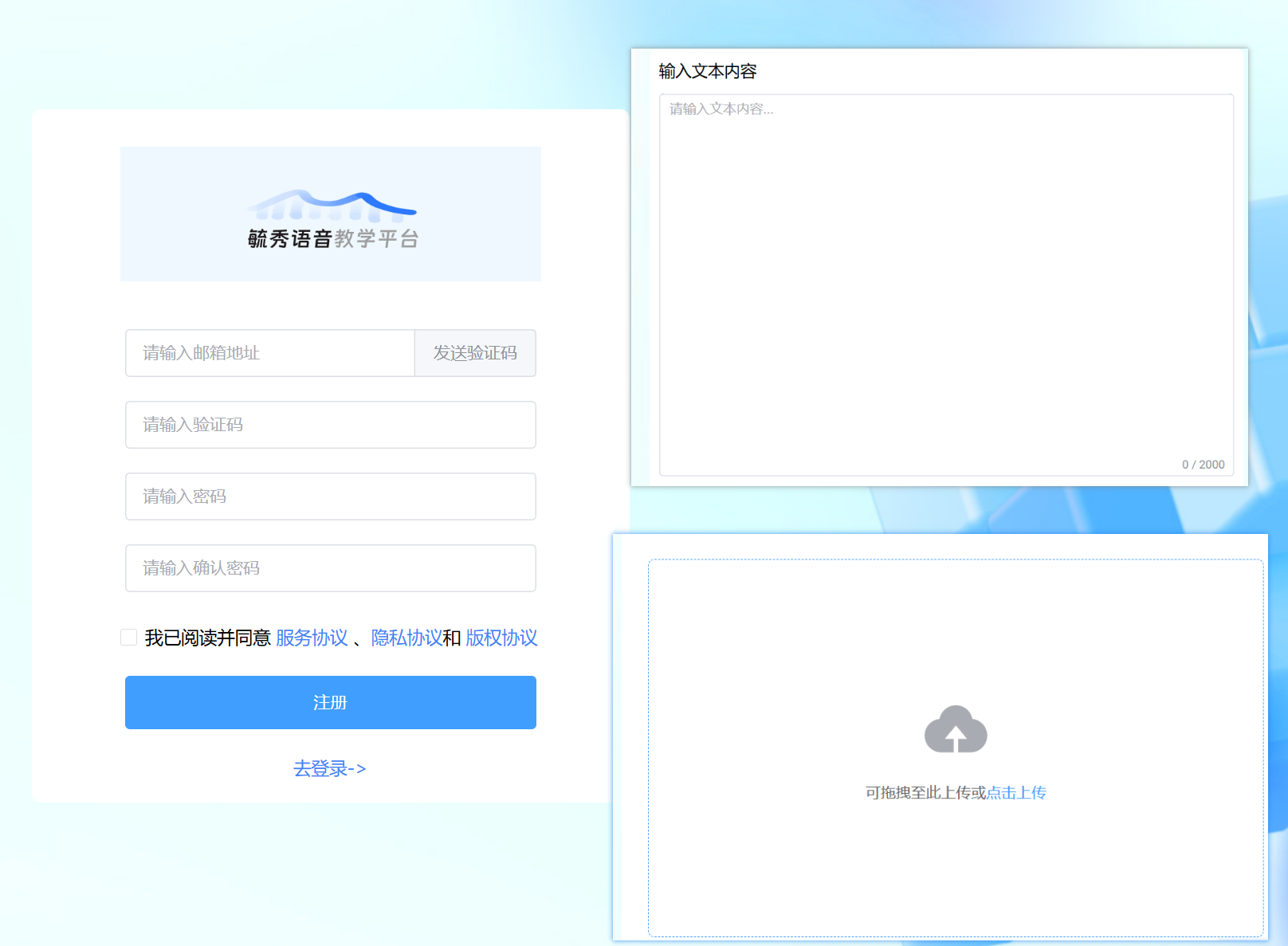
As shown on the left, an email input can include a Send verification code button inside it. The one at the upper right is a larger text area for writing a semester summary.
Layout and Feedback Components
Components such as el-dialog for modal dialogs, el-alert for notices, and el-message for feedback feel even more generally useful than a simple Button.
Anyone can make a button, even if we are lazy. Building a reliable modal dialog from scratch is much more annoying.
When I first used el-dialog, it made me realize how easily a library can create this kind of layout.
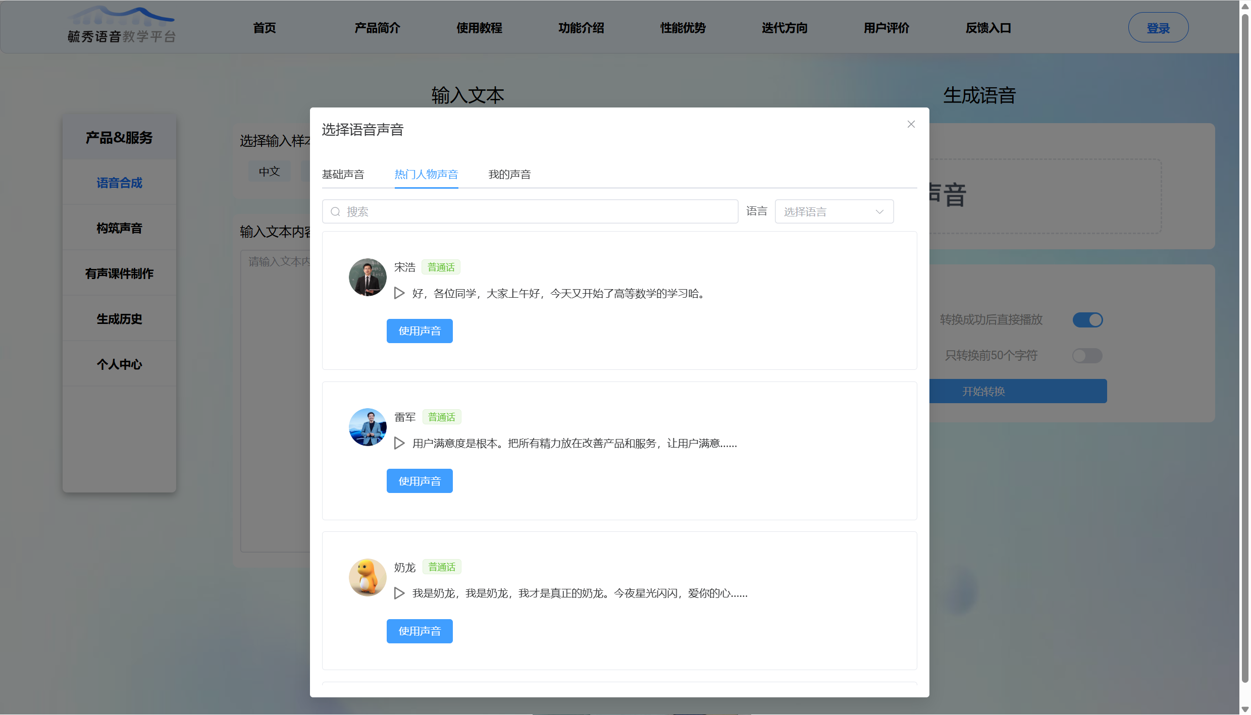
I ended up using nearly ten dialogs in my project. Compared with only navigating between pages, the application felt a level more polished.
A Drawback
Because Element UI is used for layout, it brings its own visual style. It is great for personal projects, but in a formal team project the requested UI design may not be compatible with Element’s style.
So it is useful, but do not become too dependent on it.
Other Notes
Bugs
Accidentally Reusing an Element Class Name
Element UI has built-in class names and styles. Do not casually create a class name that overlaps with one of them.
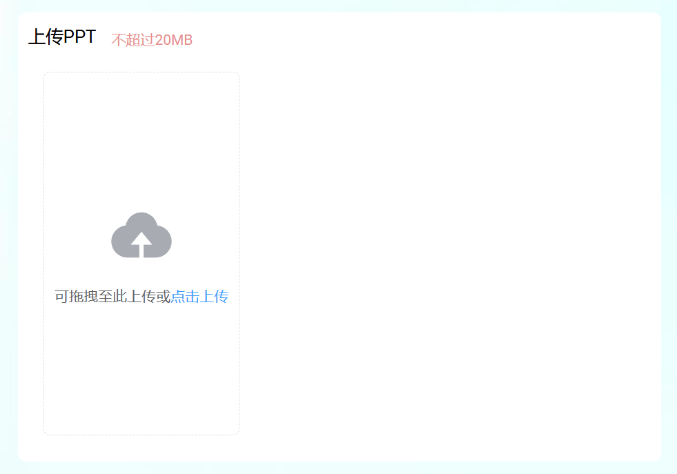
For example, I added class="el-upload" to the outer element of an <el-upload /> component. Element’s built-in styles then leaked into my wrapper:

Its display: inline-flex turned that area into a flex layout and caused the bug below.
Normal:
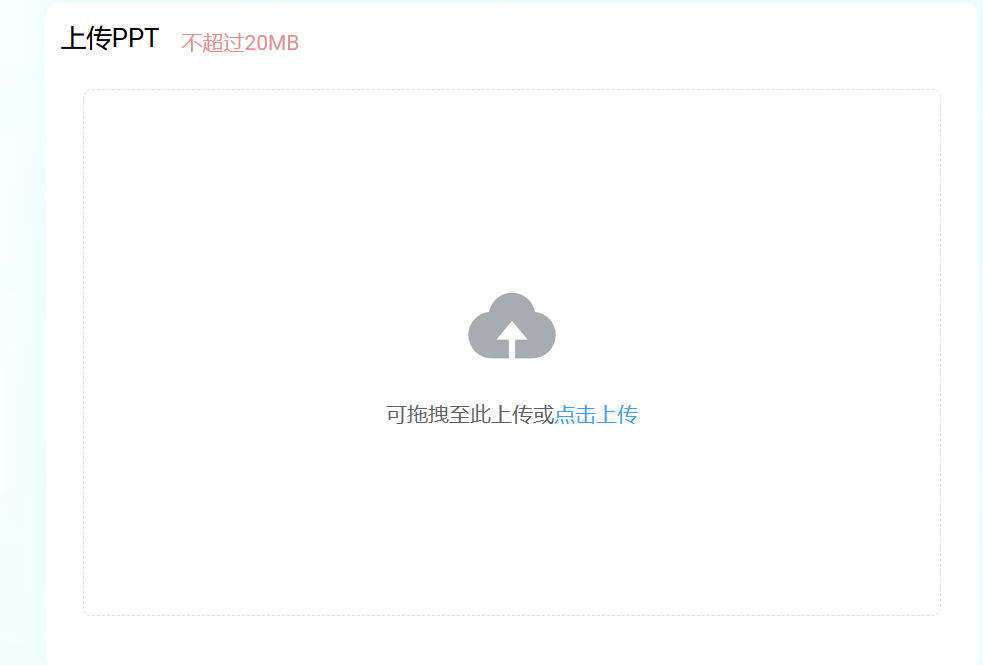
With an extra class="el-upload" wrapper:
Adding scoped While Overriding Component Styles
You normally do not edit Element’s source code. If you just want to adjust a component’s color or size, write CSS for it in your own <style> block.
Use DevTools to find the class for the exact layer you want. Element components often have several nested layers, so make sure you have selected the right one.
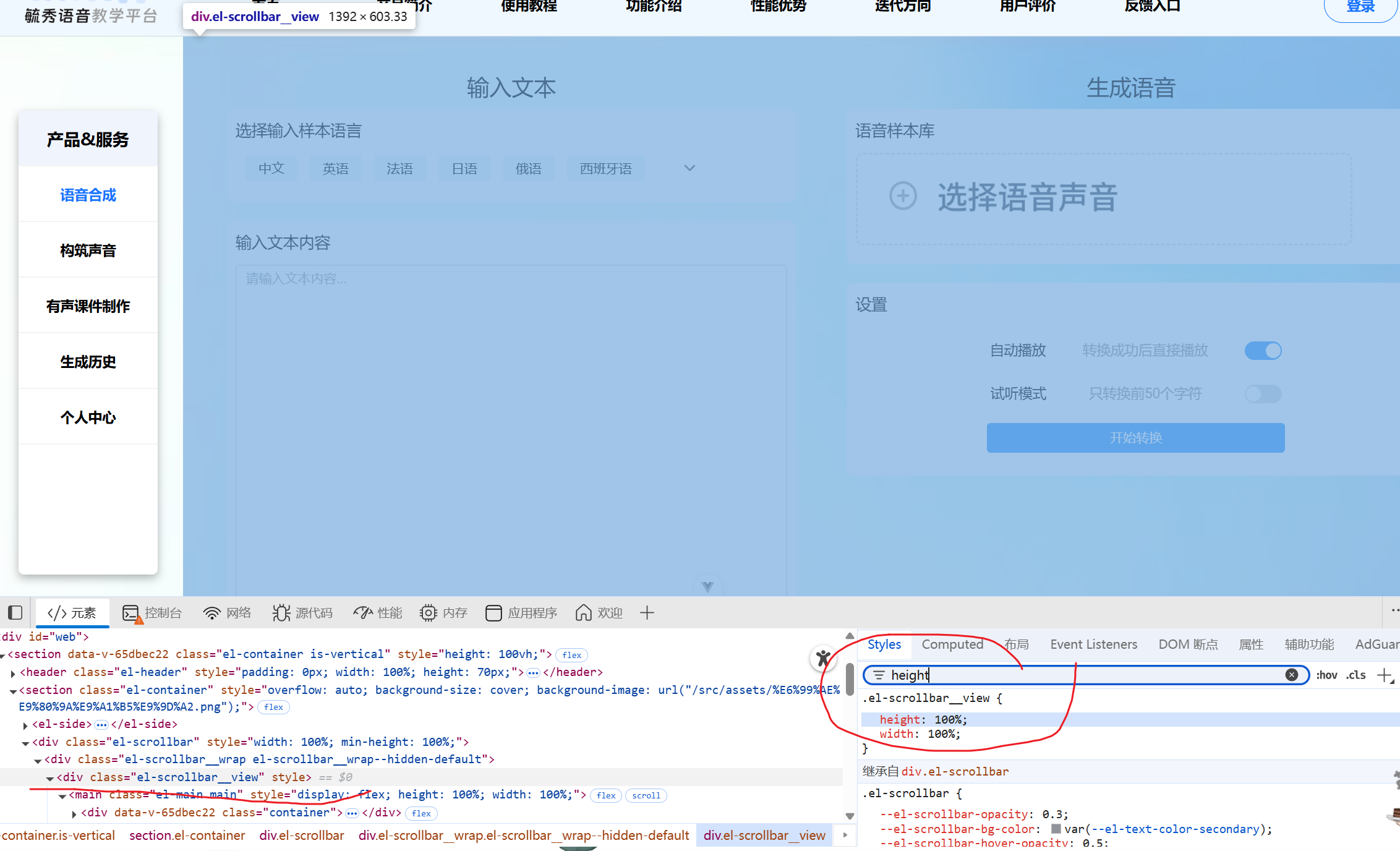
If you usually add scoped to every Vue style block, create a separate unscoped <style> block for this override, or wrap the selector in :global().
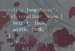
The scoped attribute limits styles to the current component file, while Element’s generated DOM belongs elsewhere. Remember not to scope the override.
A Shortcut for Throwaway Projects
Element UI is well-known enough that AI tools understand it. When you are building with Element components, you can ask for something like Generate an ElMessageBox with an account and password field and get a quick starting point.
It is very convenient. But if you keep doing that and never review the result properly, the project will probably become a mess.
Overall Impression
Element UI is obviously not a universal solution, but it is practical and versatile. It also helped me recognize standard UI patterns, such as a switch component.
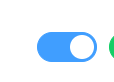
HTML does not have every one of these components built in, but developers tend to use the same names and roughly the same interaction patterns.
If you have not used Element UI, I recommend trying it in a personal project. It improves both speed and understanding. Read the official documentation linked above, or search for Element Plus directly.